If OmniFocus is the fabled king of the productivity world on Mac OS X, Things is certainly the up and coming prince with great potential in its own right. We are going to explore what Things does right and what it could do better, and we will see which productivity app is right for you on Mac OS X.
(Note: This is part 2 in a series about productivity apps on Mac OS X. Be sure to check out part one, where we reviewed OmniFocus.)
Things Review

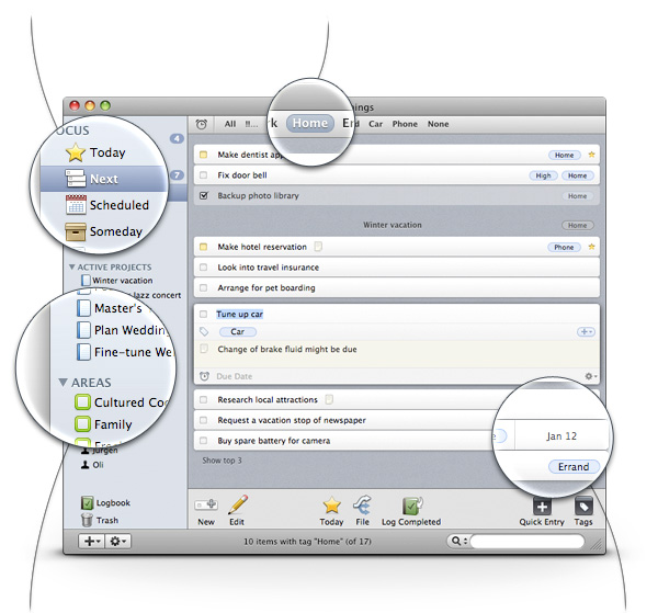
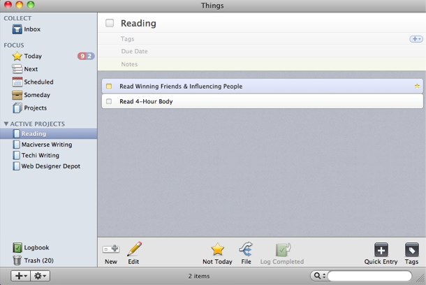
The first thing you notice about Things when you start it is that the interface design is far superior to OmniFocus. There is the familiar sidebar and buttons for actions that appear on the bottom of the application. But even though there is still a reasonable amount of information presented to you, it does not feel overwhelming nor complex.
Creating a new task is simple enough: a click on the “New” button brings up a new task that prompts several different options for the user. You can enter a titles, tags, notes, and a due dates all from the same entry point. I never actually bothered with the tagging features, but I did take advantage of the notes section often for every task I created. This, alone, was an incredibly useful feature that I exploited to the fullest.
Once you create your tasks, there is also a straightforward method for organizing these tasks. The default way is to create tasks in your inbox, which is simply a listing of tasks that were created but not filed somewhere. But you’ll eventually want to organize your tasks into the “Focus” area of the application, where you can mark the task as “Today,” “Next,” “Scheduled,” “Someday” or “Projects.” The today and next options allow you to assign the task to be completed today or in the future, respectively. The schedule option allows you to assign a task in the future, but it will not be displayed (thus not interfering with your current tasks) until the assigned date. The someday option allows you to mark tasks that are in limbo and should be considered someday. Finally, the projects area creates a new project (more on that in a bit).

Any task marked as today will show up in the today section, which includes tasks that have the current day as a due date. It keeps things simple, allowing you to focus on working on what you need to get done right now. It also shows what tasks are due or overdue and by how long.
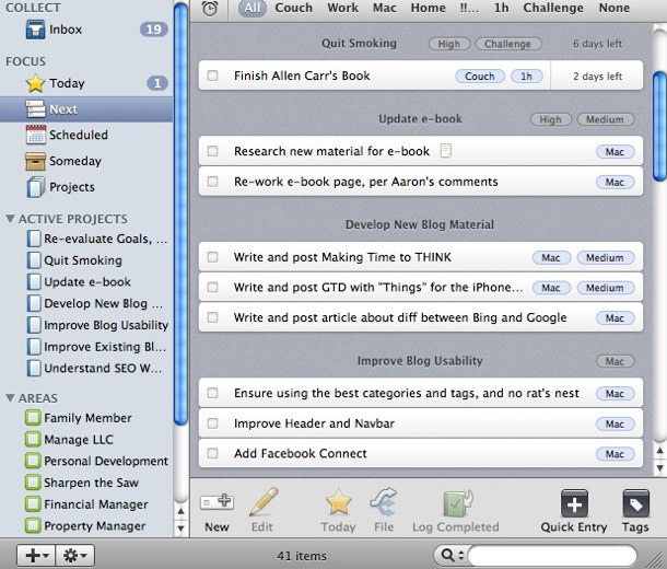
Tasks in the next section are organized more like a traditional list, going down the line of tasks that are due in order. You can specify a filter that sorts these tasks by date or you can organize and order them yourself. Regardless, this area gives you an idea of what is on your list to deal with for the days ahead.
The schedule section is unique in that it allows a user to set tasks to be displayed in the future. Not only that, but it also gives users the ability to set recurring tasks, which is a feature I found quite useful. I have recurring tasks for certain days of the week for chores and other things I have to do on a weekly basis — it saves me the time of having to enter in these tasks manually.
The someday section isn’t that interesting — it functions exactly as it sounds. It’s just a brain dump of tasks you want to handle someday but not right now. I didn’t use this feature as much, but I could see the use scenarios.

Finally, there are projects. If you drag a task into the project section it is converted into a project and is given its own “folder” where related tasks can be placed in and grouped together. Alternatively, there are various ways to create projects throughout the interface. You can think of a project as a grouping of two or more tasks that must be completed.
There are also options to add areas of responsibility and teammates for collaborating on tasks. I did not need to take advantage of these features, so I did not use them. But they are sure to be welcomed for those who participate in a collaborative environment.
So, after understanding how Things operates, what was it like to use the application itself? Well, I really enjoyed it.
I was very much at ease with the Things interface. It made task management easy and accessible. Most of what you do within Things will be performed from within the main window itself, and very rarely will you find it necessary to explore the menus to perform an action. It is very well laid out in this regard, and it was a pleasure to use.
Things started out easily enough. I was keeping on top of things and was excited to use the application. But after the end of the first week I had slipped up and fallen behind on some of my tasks. Thankfully, Things really did help me keep on top of what I was behind on and what needed to be done today. I managed to catch up, and for some odd reason I think Things helped motivate me to get things done. It was that much of a joy to use.

Pushing on to the end of the second week, I had managed to catch up with all my tasks and complete all of my projects and have a logbook full of successful endeavors. I had no issue with using the application, and I explored most of the functionality quite rigorously. I didn’t want to stop using it.
I really enjoyed my experience with Things. I felt that the application was overpriced for what it offers at $49.99 for the Mac OS X version (with additional costs for mobile versions). But I felt that the application was providing me with enough value to warrant the cost. I feel that this application adapted to my workflow perfectly and the simple, beautiful interface was icing on the cake.
OmniFocus vs Things
Now it is time to answer the biggest question of them all — which is better: Things or OmniFocus?
If I were to define best in my own terms — and from what you could see in my review — Things would win hands down. The simple and beautiful user interface, the ability to easily add tasks with notes, and the drag-and-drop functionality really won me over. But I am not writing this article only for myself; I am writing it for everyone else.
So, there are three primary factors to consider when it comes to these two applications: workflow, interface, and connectivity.
You owe it to yourself to try both of these applications and determine which workflow works best for you. OmniFocus has an elaborate workflow with recommendations about how you should act upon this workflow. It is a fairly involved process. Things, on the other hand, has a more straightforward approach that is easier to use. This is where it shines, but in doing so, it might not be as comprehensive or customizable for power users.
Both applications have a unique interface that takes some getting used to. OmniFocus takes advantage of keyboard shortcuts, columns, and text entry significantly more than Things, which uses drag and drop actions to accomplish most of the tasks. Both applications have a quick entry for entering tasks, too. But it must be said that Things does have the better looking interface; it might also be considered more refined and accessible. But both applications are great.
Finally, connectivity with iOS is the last primary thing to consider with these applications. Both applications have mobile versions, so you can be sure that you can keep on top of your task management while on the go, but each application has a unique interface and workflow on their mobile platforms. Considering the importance of mobile and iOS, it makes sense to try out these applications on iOS before making any purchase decisions, especially if syncing these tasks is important.
Conclusion: if you prefer simplicity, Things wins without question. Its superior interface simply can’t be ignored. If you prefer customization and power features, OmniFocus wins. Just be aware that there is a bit of a learning curve and adjustment to take advantage of it.
In the end, however, either one of these applications should help you become more productive, and in that case the user always wins.
